The anvi'o interactive interface

Table of Contents
- Download the datapack
- The interactive interface at a glance
- First exercise - basics of the interface
- Launching the interface
- Understanding the display
- Change cosmetics and save the state
- Use the Data tab
- Export the image as an SVG
- Second exercise - more cosmetics, bins and search function
- Launching the display
- Understanding the display
- Cosmetics: change the radius, remove and add layers
- Re-order the layers and color genomes by group
- Create bins and save a collection
- Use the search function
- Third exercise - phylogram, bootstrap values, data type
- Launching the display
- From a circle to a rectangle
- Bootstrap values and rooting the tree
- Cosmetics: bar, intensity, line, text, size
- Explore existing states
- Bonus
- Final words
Summary
The purpose of this tutorial is to help you become comfortable with the anvi’o interactive interface. It is really aimed at first-time users who are just discovering anvi’o. It can be useful at the beginning of a week-long workshop about anvi’o, or as a place to come back if you remember a trick or two that you learnt here. If you are already familiar with the interface, the first exercise will feel very very easy to you and you could skip directly to the second exercise or later.
To get the most out of this tutorial, you should check the interactive webpage, which describes most of the functions of the interactive interface.
If you have any questions about this tutorial, or have ideas to make it better, please feel free to get in touch with the anvi’o community through our Discord server:

Download the datapack
The datapack for the tutorial includes the necessary databases and other files that we will be using throughout this tutorial. To download them, simply copy and paste the following code into the working directory of your choice:
curl -L https://cloud.uol.de/public.php/dav/files/SMzBr8KbrKgQKrN \
     -o interactive_interface.tar.gz
Then unpack it, and go into the datapack directory:
tar -zxvf interactive_interface.tar.gz
cd interactive_interface
At this point, if you check the datapack contents in your terminal with ls, this is what you should be seeing:
$ ls
AUXILIARY-DATA.db CONTIGS.db        data.txt          GENOMES.db        PAN.db            PROFILE_MANUAL.db PROFILE.db        tree.nwk
The interactive interface at a glance
The anvi’o interactive interface is a browser-based, fully customizable visualization environment. It allows you to explore complex ‘omics data through an intuitive graphical interface, and produce publication-ready figures that can be exported as SVG files for further refinement in vector graphics editors such as Inkscape.
At its core, the interface displays items organized by a hierarchical clustering (a dendrogram or tree) at the center, surrounded by concentric layers of data. The meaning of items and layers changes depending on the context (contigs and samples for metagenomics, gene clusters and genomes for pangenomics) but the interface itself works the same way.
Programs that produce an interactive display
Several anvi’o programs open an interactive display. The most commonly used are:
- anvi-interactive — the main interface for metagenomics, read-recruitment, manual mode, and more.
- anvi-display-pan — the pangenomics interface.
- anvi-inspect — a nucleotide-level contig inspector.
- anvi-display-contigs-stats — summary statistics for contigs databases.
- anvi-display-functions — a browser for functional annotations.
- anvi-display-metabolism — an interactive view of metabolism estimation data.
- anvi-display-structure — a protein structure viewer.
And a few others. This tutorial focuses on anvi-interactive and anvi-display-pan, but the concepts apply broadly.
Vocabulary and anatomy of a display
Before diving into specific displays, it is essential to understand the vocabulary that anvi’o uses across all its interactive interfaces. The interactive artifact documentation contains a detailed terminology section with annotated screenshots that walk you through each concept step by step:
- Items and layers: what they are and how they form a data matrix.
- Items order and layer order: the two dendrograms that organize the display.
- Views: how to switch between different representations of the same data.
- Bins and collections: how to select and group items.
- Additional data for items and layers: how to enrich your visualizations.
We strongly recommend reading the terminology section of the interactive artifact documentation before continuing with this tutorial. It will make everything below much easier to follow.
First exercise - basics of the interface
For the first exercise, we will use a mock dataset that represents what you would get from a read-recruitment analysis. The purpose of this tutorial is not to discuss how we generated this data, but if you are interested, you can check the following tutorials: a simple read recruitment exercise, competitive metagenomic read recruitment explained.
Launching the interface
Copy and paste the following command to start the interactive interface:
anvi-interactive -p PROFILE.db \
                 -c CONTIGS.db
The two arguments are two essential databases in the anvi’o ecosystem, the contigs-db and the profile-db. The first one contains sequence information, like DNA sequence, gene calls, functional annotations and more; and the second one contains read recruitment information.
Understanding the display
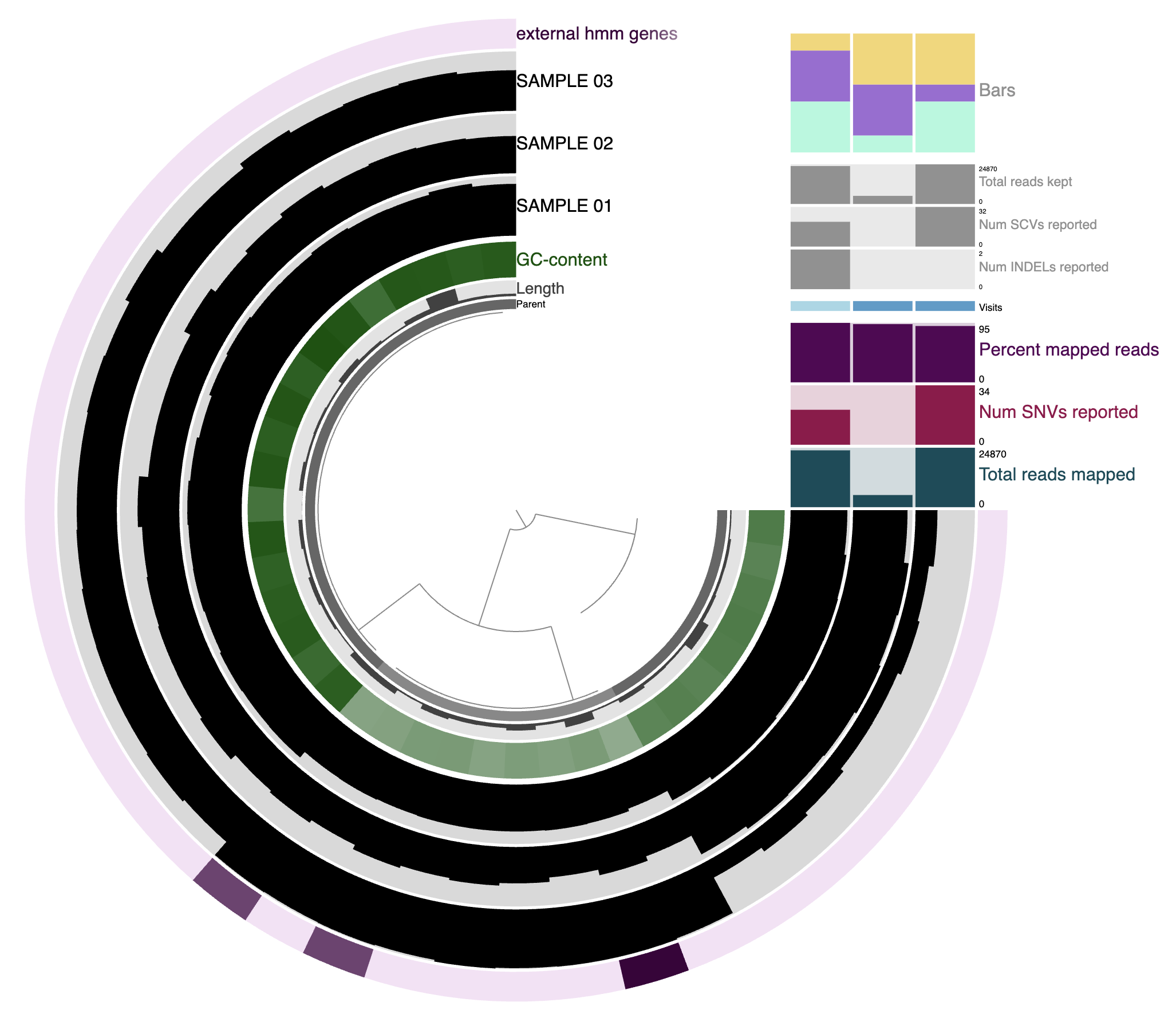
In a typical read-recruitment display:
- The items are contigs or splits of contigs.
- The layers are samples, typically metagenomic samples. In this context, they are shown as the three black layers.
- The dendrogram at the center organizes contigs based on their sequence composition and differential coverage across samples (or whichever clustering method you chose).
- Additional data for the items and layers are also visible. They can be extra information added by anvi’o directly (like GC content here), or by the user like the top-right barplot.
First time looking at the interactive interface?
If this is your first time looking at the anvi’o interactive interface, take some time to get familiar with the central figure and also with the multiple tabs in the Setting panel on the left. The settings panel section of the interactive help page describes in great detail the content of each of these tabs, but in brief:
- Main: where you can change most of the aesthetics of the figure: order, color, height, margins of each layer.
- Options: more advanced settings for the display.
- Bins: bins are selections of items on the display. In this tab you can create and manage your bins and collections.
- Data: will show you the underlying values/data when hovering your mouse on the display. Useful to know the actual number displayed as a bar plot for instance.
- Notes: a little markdown editor where you can write and save your notes.
- Search: in this tab, you can search for multiple things and highlight them on the display, including functional annotations and more.
- News: information about the latest release of anvi’o and sometimes more (we don’t update that section very often).
- Anvi’o: a list of useful links to the discord, github, the anvi’o website and how to cite anvi’o.
- Draw: draw or refresh the display. Probably the most important button.
- Save / Load State: save or load the state of the display, meaning the configuration of the interactive interface: cosmetics and organizational settings.
- Export: download an SVG of the current display.
- Align: reset the figure at the center of the display.
Change cosmetics and save the state
Your first task is to change the color of some layers, like the three sample layers:
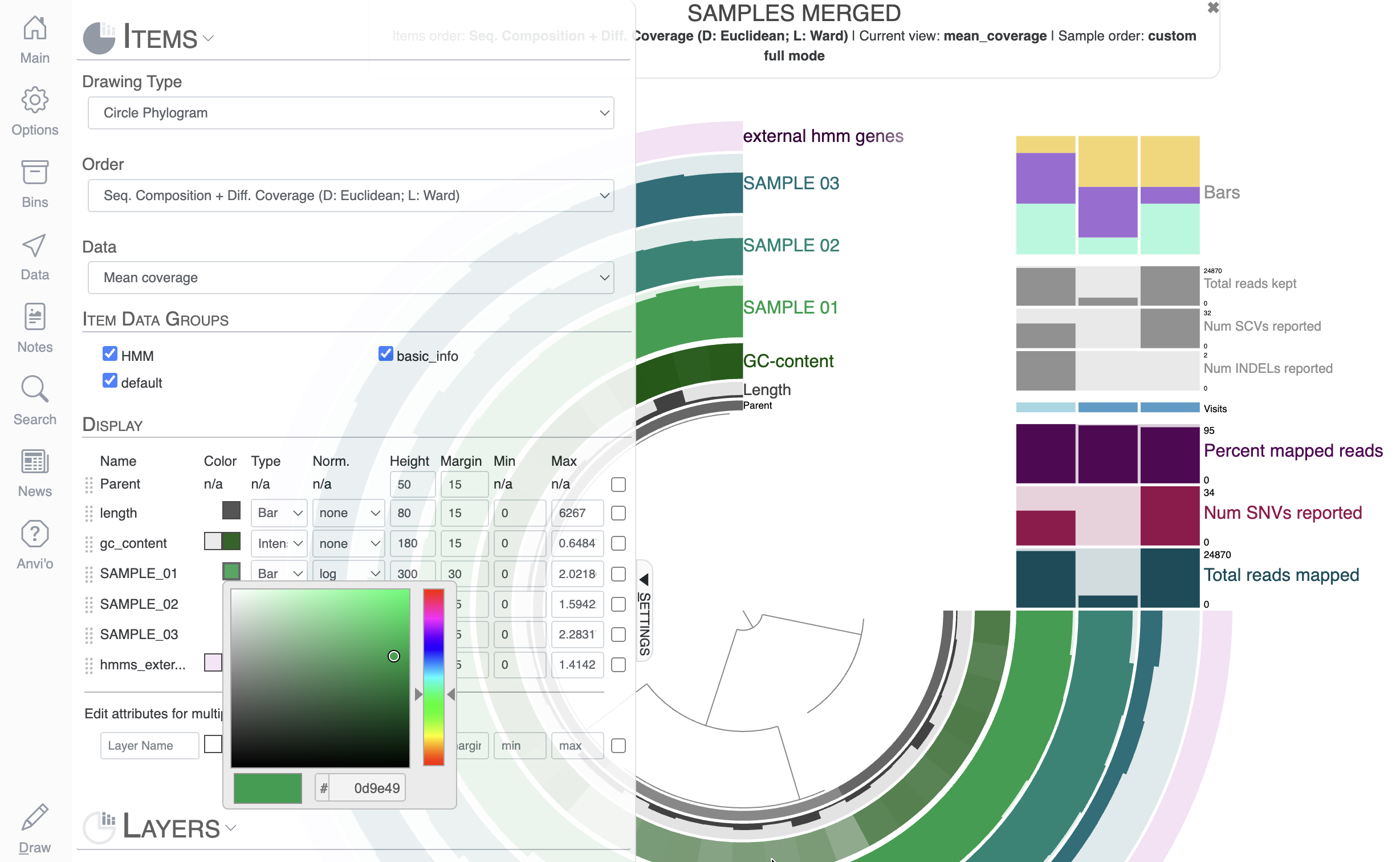
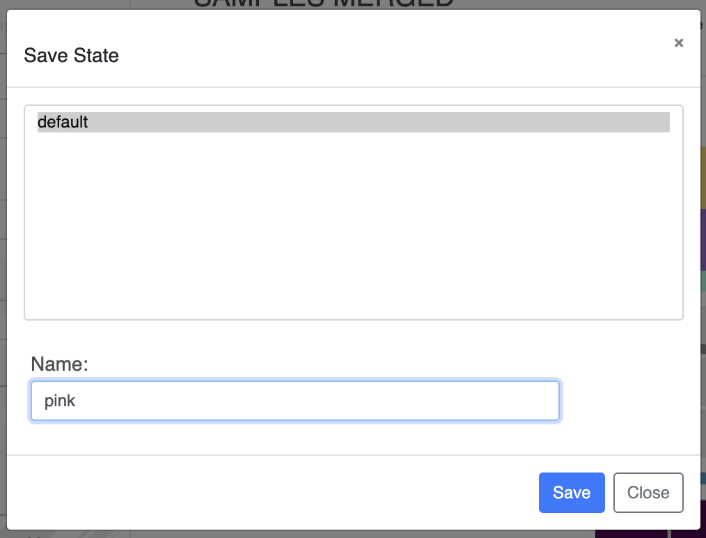
You can directly change the colors of each layer in the Main tab by either manually selecting a color, or copy-pasting a hexadecimal color code directly. Now that you have made some modifications to the display, you should probably save them, otherwise they will be lost when you re-open the same interactive interface. To save the State of the display, click on the “Save” button and choose a name for your current state.
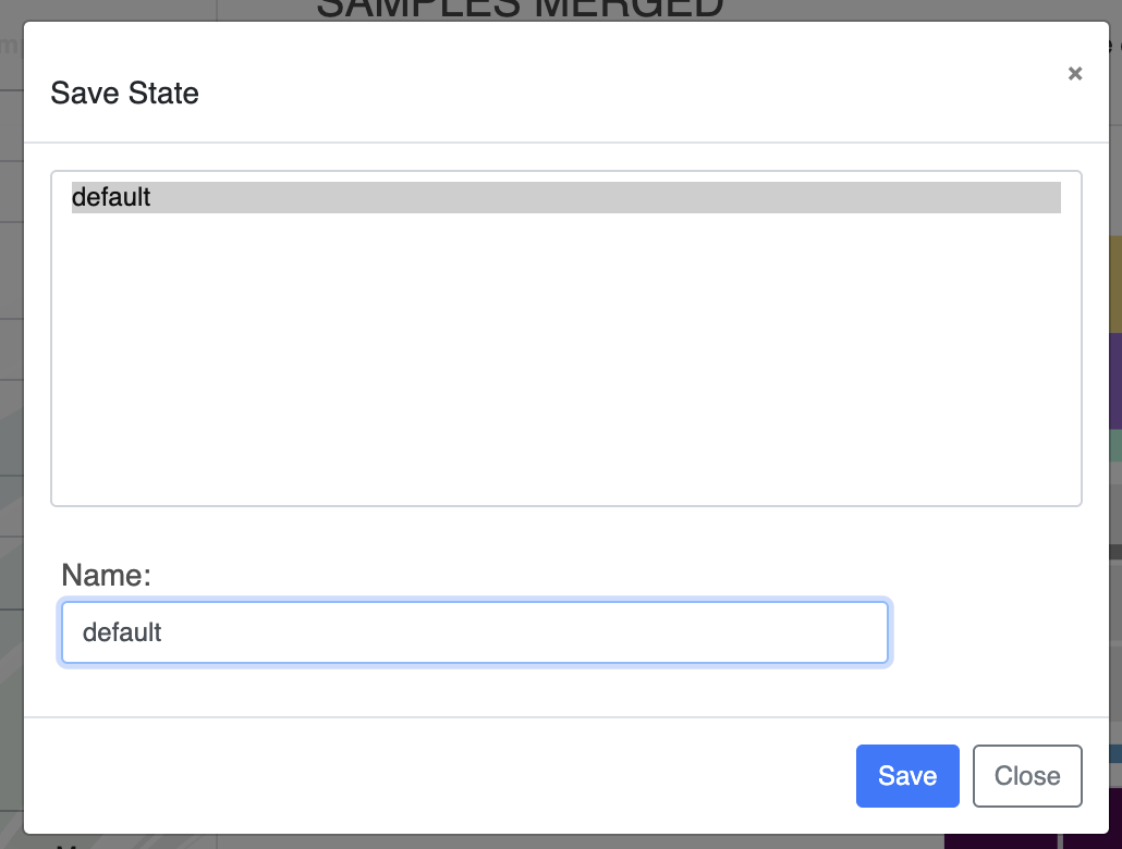
If you save a state called ‘default’, it will automatically be loaded when launching the interactive interface.
Your second task will be to apply the same color to all sample layers. You can manually change the color for the three layers one by one, but one day you will have a display with 100 layers and YOU REALLY DON’T WANT TO CHANGE ALL OF THEM ONE BY ONE. So you can use the ‘Edit attributes for multiple layers’, which applies a change (color, height, etc) to the selected layers. You can select layers by checking the right-most checkbox, or you can search for layer names matching some characters like this (hit enter or click away from the box for the changes to apply):
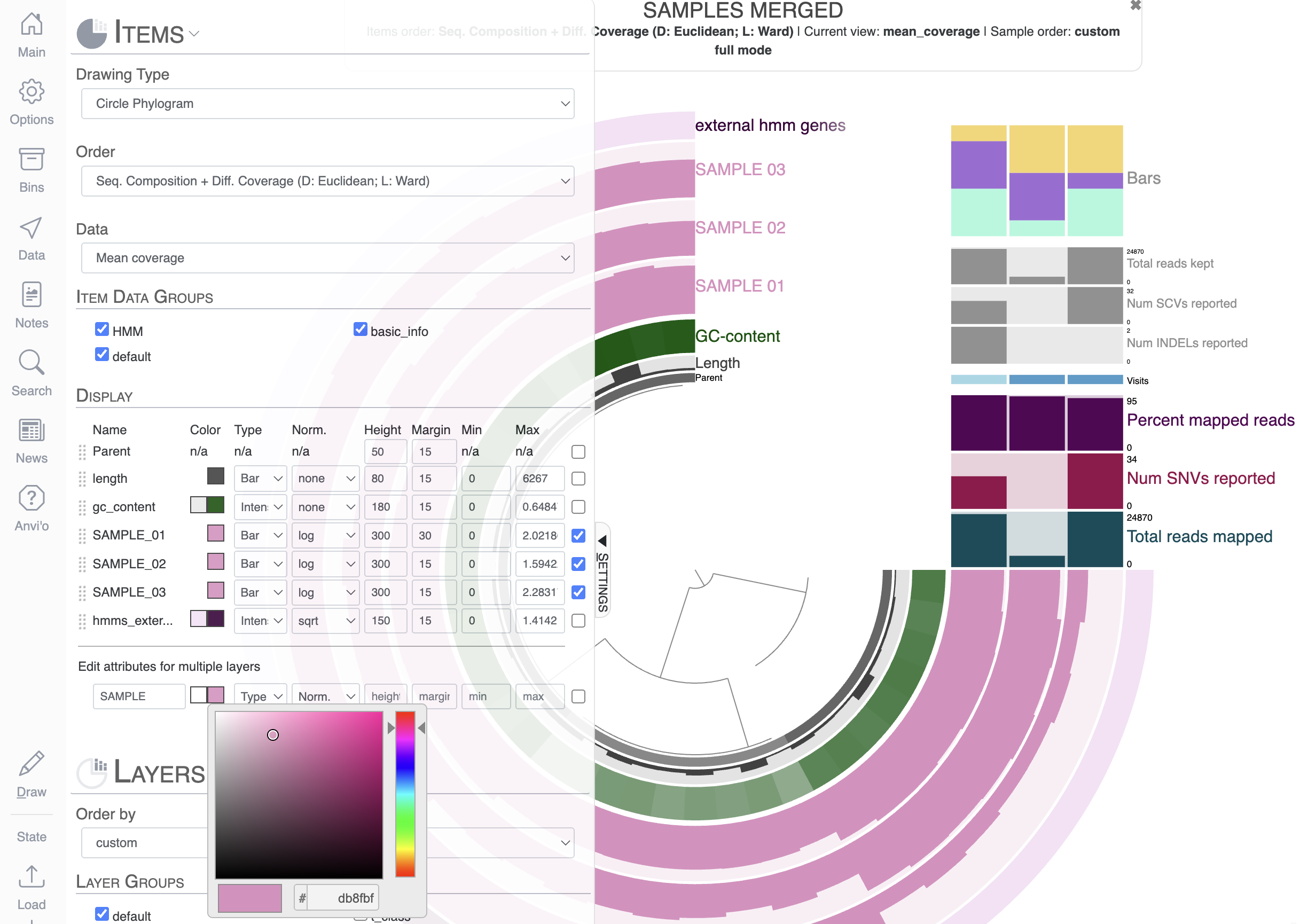
Don’t forget to save the new state if you want to keep it. You can override the ‘default’ state, or you can save it with a new name. You can save as many states as you want.
Now you should be able to load any of the two saved states using the Load button. Don’t forget to refresh your display by clicking on Draw.
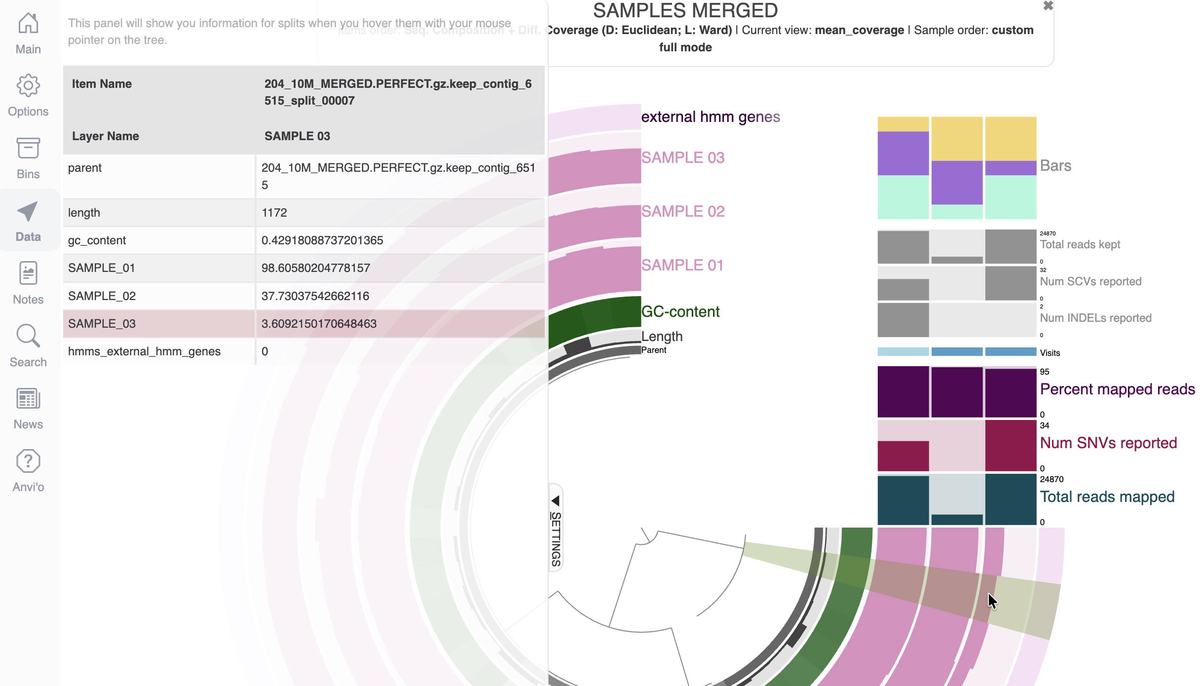
Use the Data tab
As you can see from the display, we have loads of barplots, which are nice but what if you are interested in the underlying values behind these bar plots? Well, that’s exactly why the Data tab exists. Click on it, and hover your mouse over the display to see all the underlying data that make up the figure.
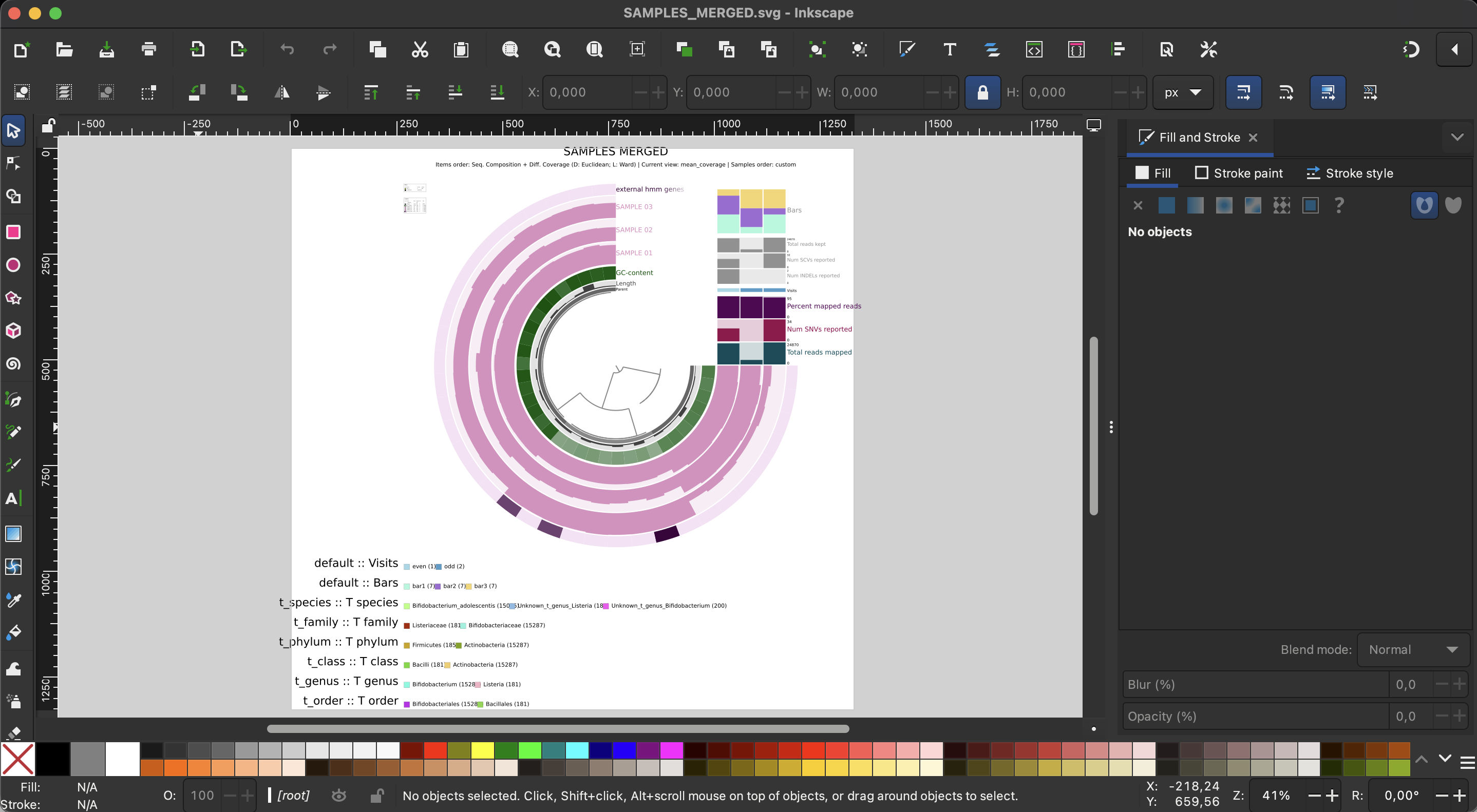
Export the image as an SVG
If you are now happy with your figure and want to include it in your manuscript, you click the Export button to get an SVG file which you can then edit with your favorite vector image software (cough cough - inkscape).
Second exercise - more cosmetics, bins and search function
For the second exercise, we will be using a small pangenome of a few Enterococcus faecalis genomes. Once again, this tutorial is not about how we generated this pangenome or how to analyse it, but rather to use it as a means to explore the possibilities of the interactive interface. If you want to learn more about pangenomics, you can check the following tutorials: a simple pangenomics exercise, a pangenome tutorial using Trichodesmium genomes.
Launching the display
To display a pangenome with anvi’o, we need to use the command anvi-display-pan:
anvi-display-pan -g GENOMES.db \
                 -p PAN.db
Just like for the previous interactive command, we are using two databases to start the interactive interface: the genomes-storage-db and the pan-db. The first one contains information about the genomes and genes used to generate the pangenome, including gene functional annotations; and the second database contains the gene clusters computed by the command anvi-pan-genome.
Understanding the display
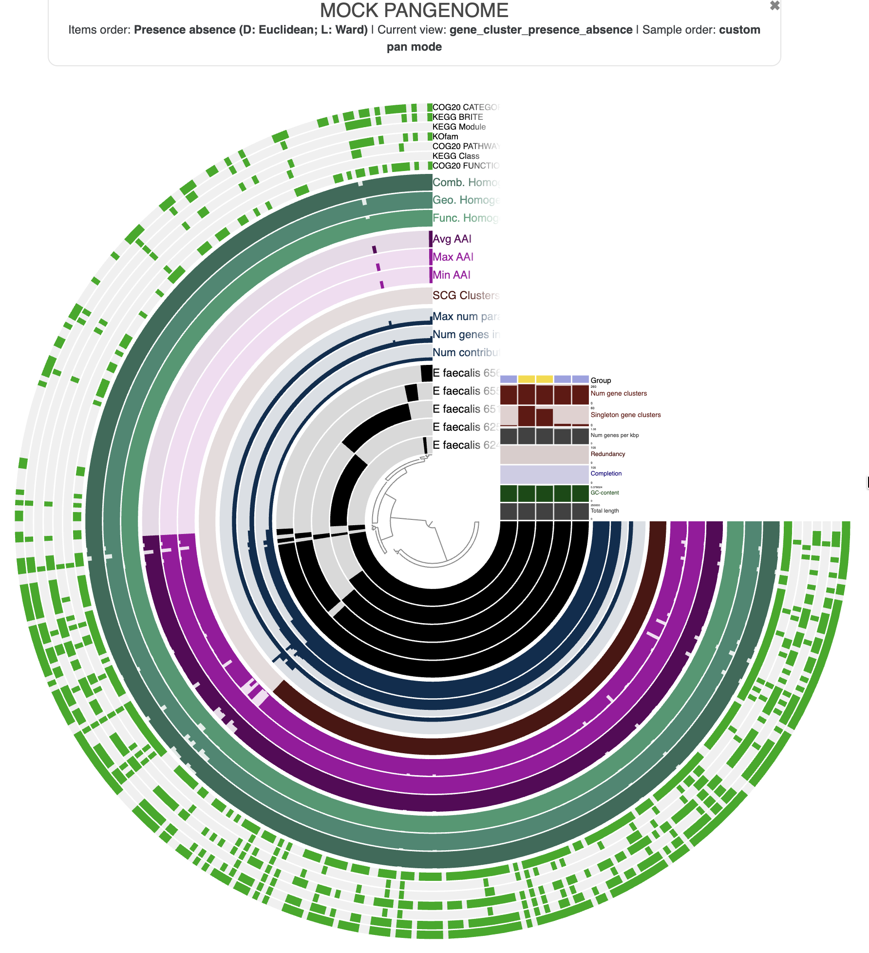
In a pangenome display:
- Items are gene clusters.
- Layers are genomes.
- The inner dendrogram organizes the gene clusters based on their distribution across genomes: gene clusters present in the same genomes will come together on the display.
- Additional data for the items and layers are also present and describe properties of the gene clusters like the average amino-acid identity (AAI), or information about the genomes like the total number of gene clusters.
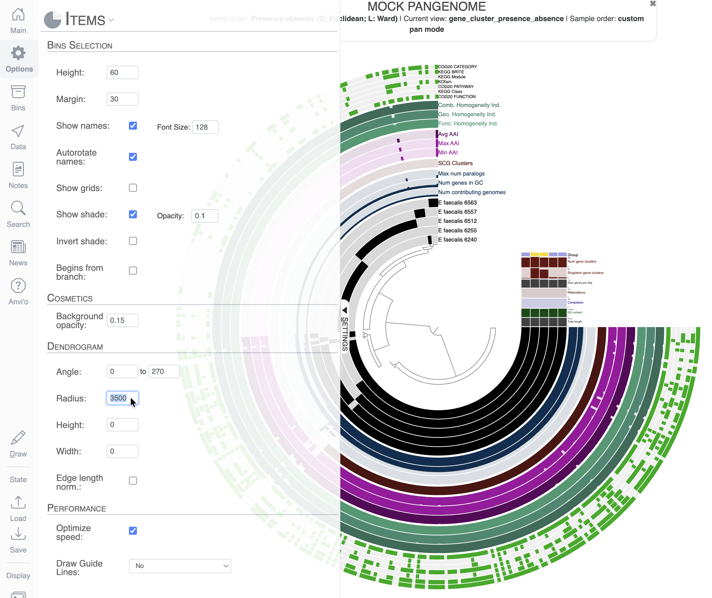
Cosmetics: change the radius, remove and add layers
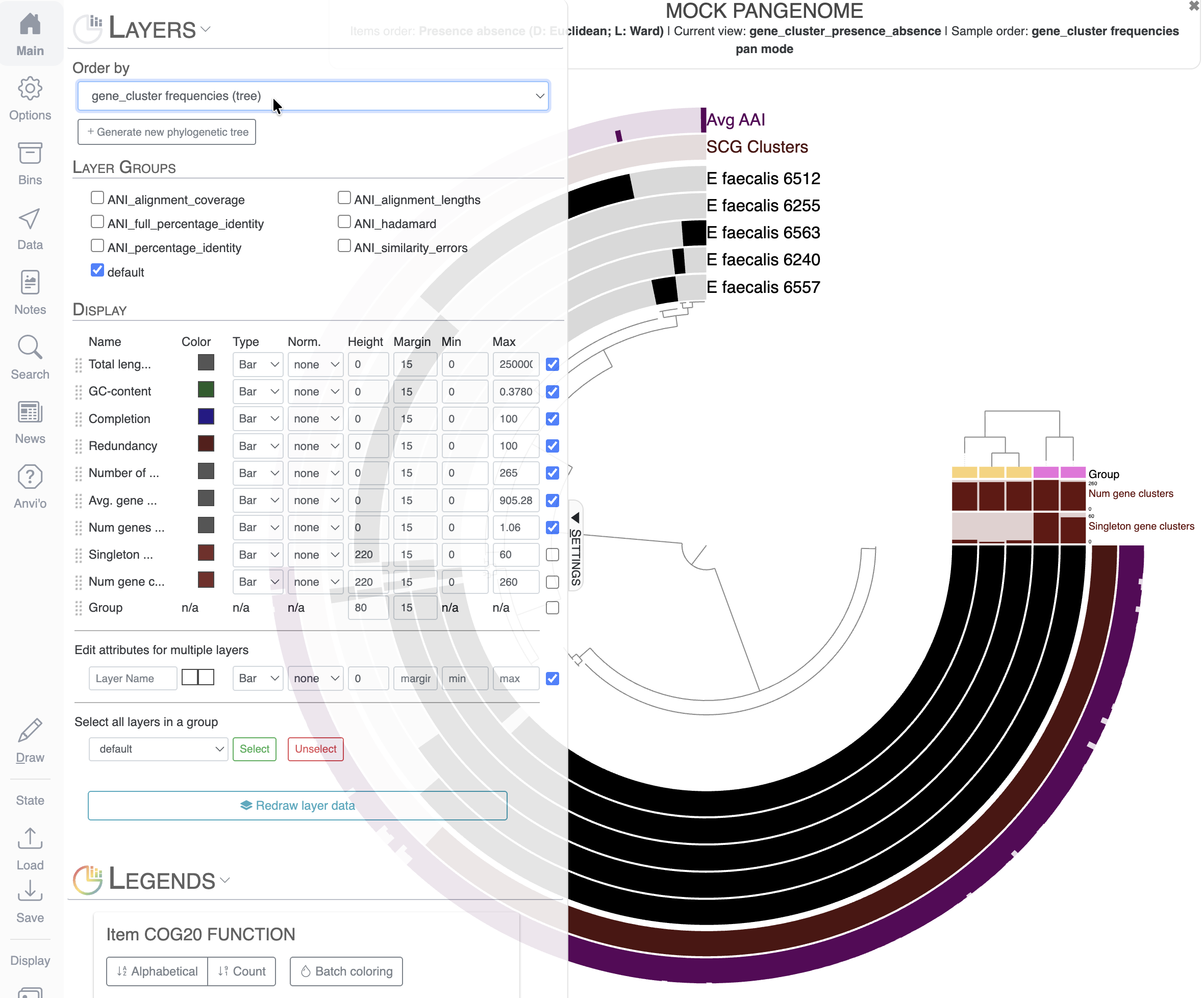
As you can see, the display is crowded with information. The first thing you might notice is that we cannot even read the names of most of the layers. To solve this, we can increase the Radius of the inner dendrogram in the Options tab. Here I changed the Radius to a value of 3500 (don’t forget to click Draw to refresh the display after changing the value):
Next we can remove groups of additional layers that are not interesting for our final figure. In the Main tab, you can simply unselect some Item Data Groups like “functional_annotation”, “homogeneity” and “gene_cluster_stats”. When you re-draw the figure, they will be automatically removed.
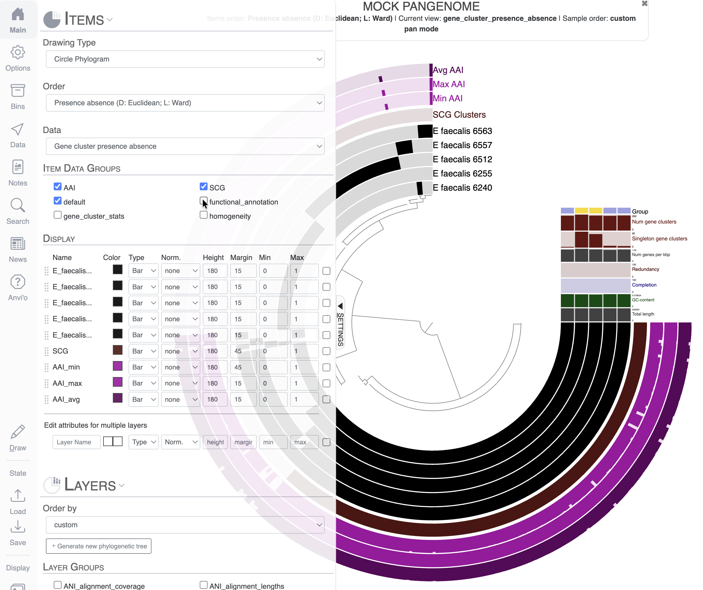
Let’s say we only want to keep the layer Avg AAI, and we want to remove Max AAI and Min AAI. You can change the height to 0 for the layers you want to remove from the display:
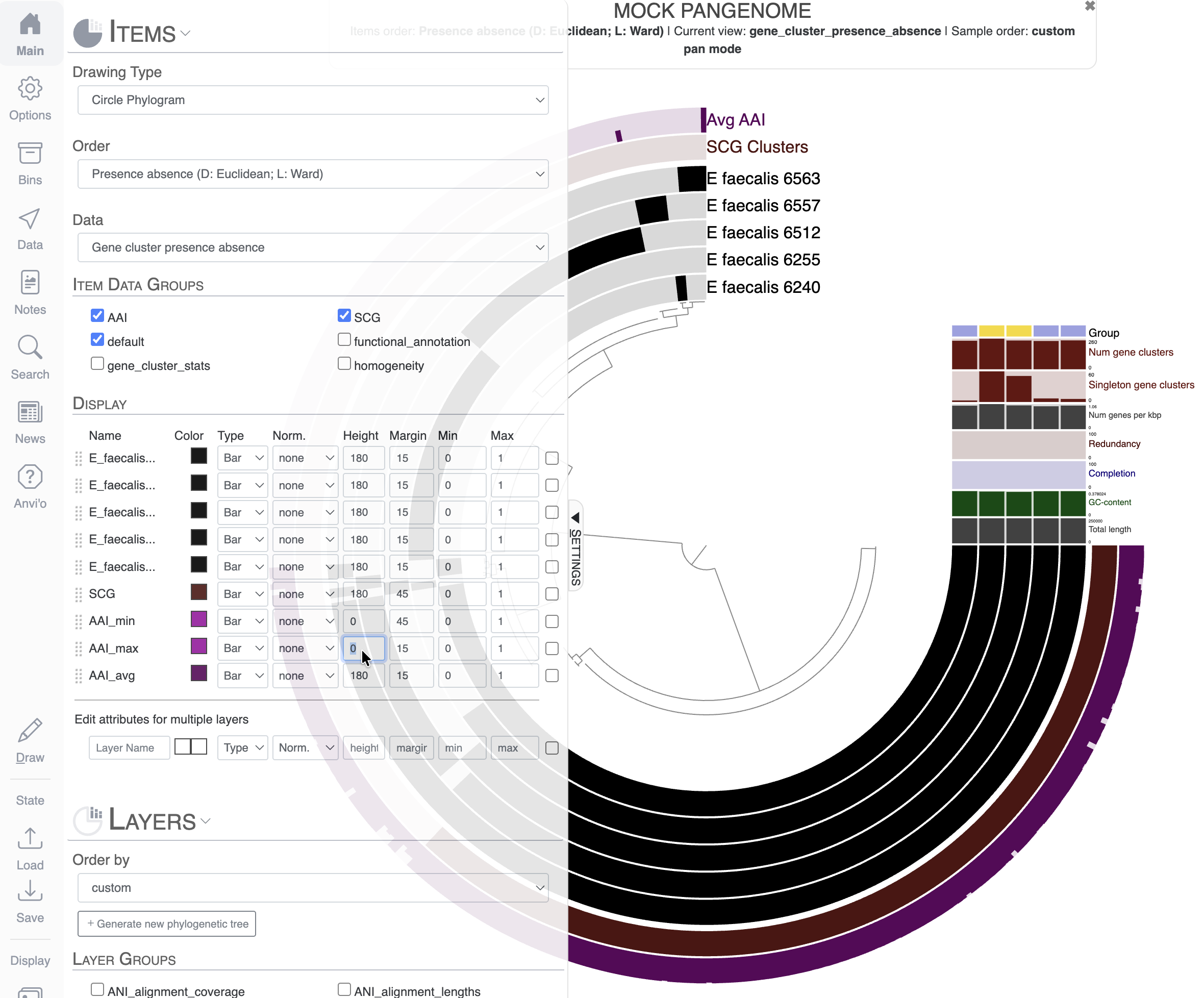
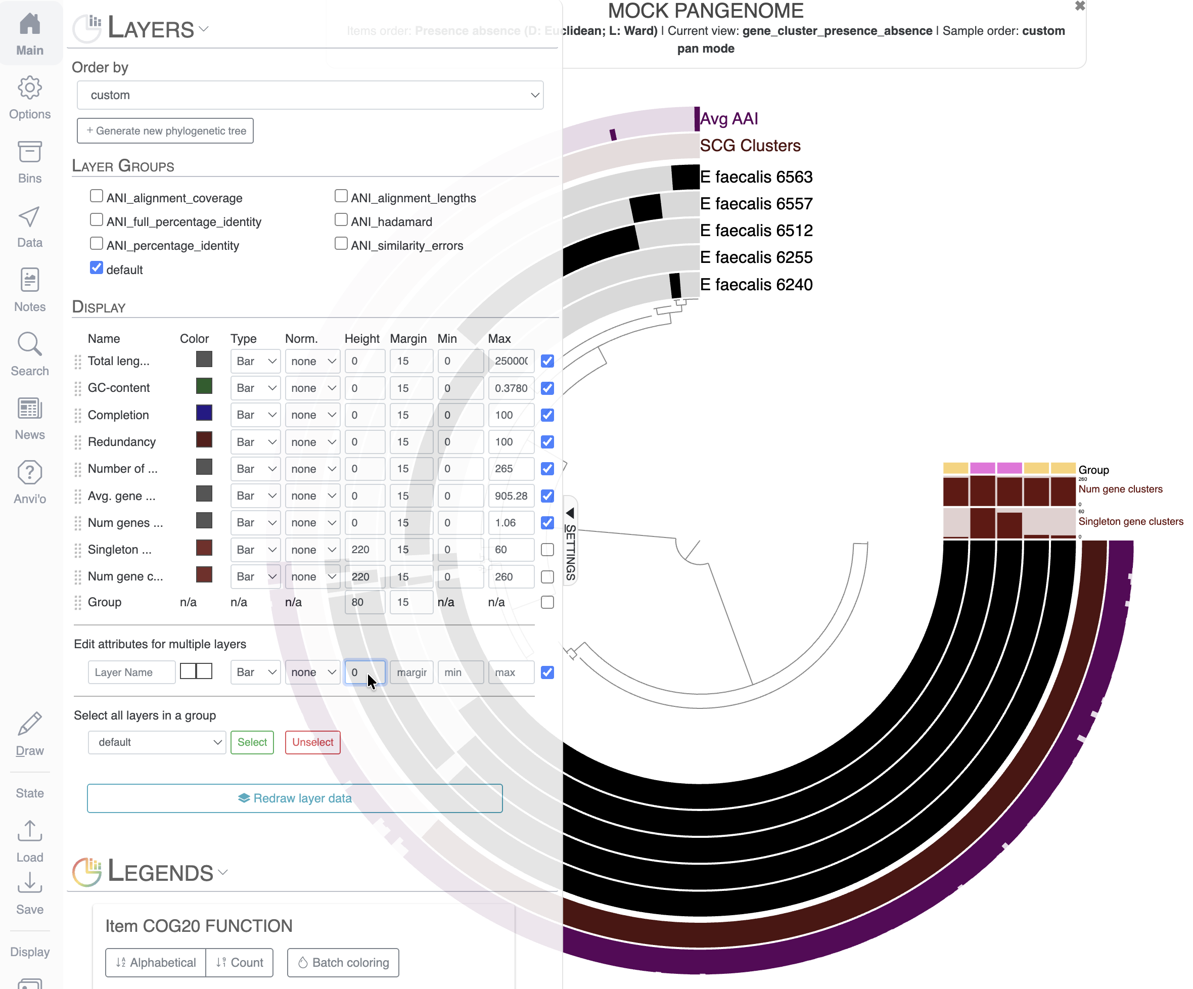
If you scroll down to the Layers section of the Main tab, you can see that we can modify the layers’ additional data in a similar fashion as the actual layers of the display. Let’s remove uninformative layers by setting their height to 0. For that, I selected all the layers I wanted to remove with the right-most checkboxes, and used the section Edit attributes for multiple layers to set the height to 0:
Great! Don’t forget to save the state. If you closed your browser or accidentally refreshed the page, you would lose all unsaved changes.
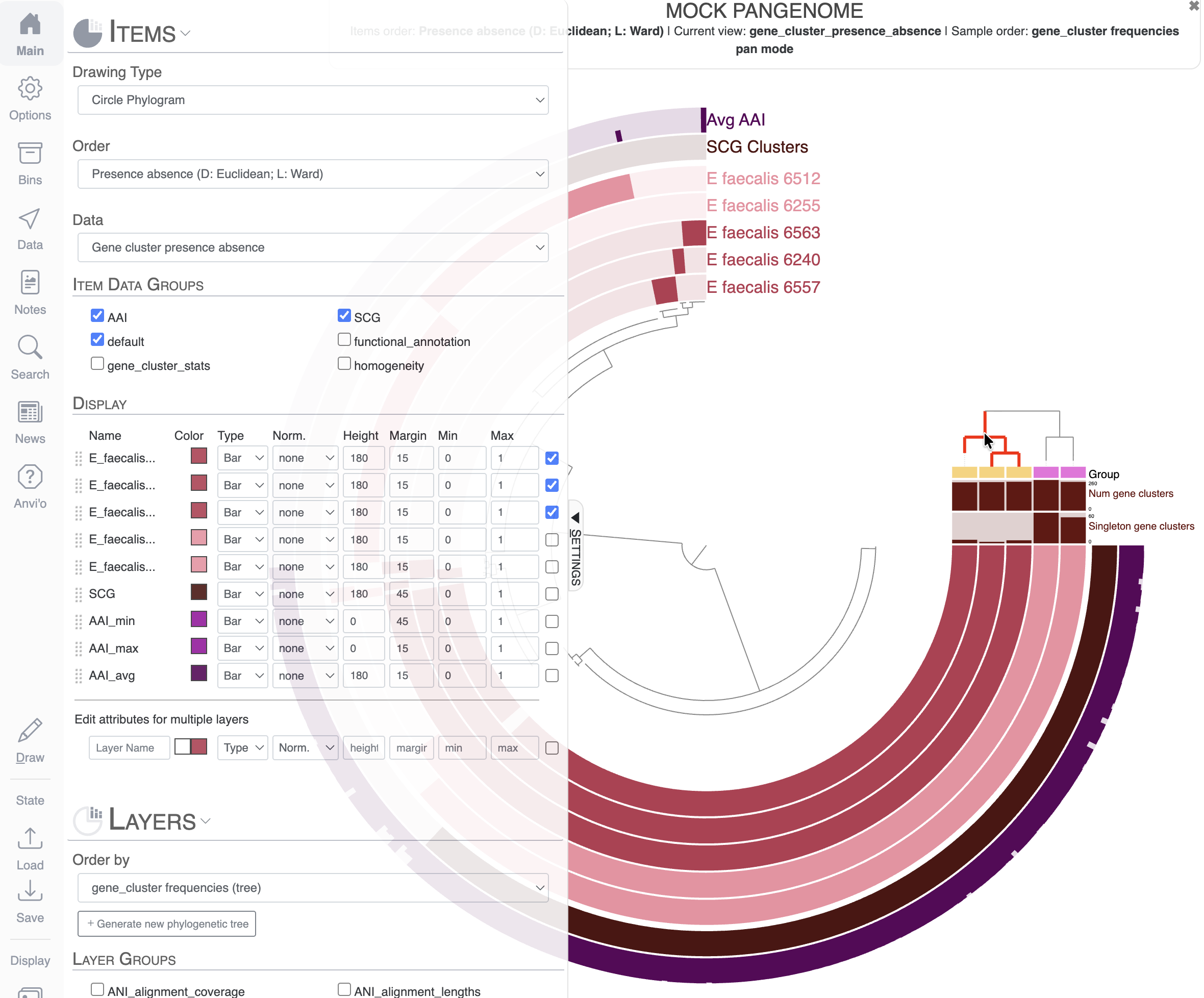
Re-order the layers and color genomes by group
The current set of genomes are ordered alphabetically by default, which is rarely the most meaningful way to represent your data. The next task in this exercise is to reorganize the layers based on some meaningful information.
For that, you will have to go to the Main tab and scroll to the Layers section. I chose to order the layers, which are genomes here, based on the gene cluster frequency (genomes sharing similar gene clusters will be grouped together).
Notice the new dendrogram on the top-right: it represents the clustering of the genomes based on the distribution of gene clusters. We now have two visually distinct groups of genomes on our display: a group of three genomes (inward) and two genomes (outward). We already have a “Group” additional layer data that matches our two distinct groups of genomes, but we can do more visually by coloring each group of genomes with a color per group.
You already know how to apply the same color to multiple layers (here genomes): you need to select them using the checkboxes. I want to show you a very useful trick using the dendrogram we just added to the display. If you hover your mouse over the dendrogram, you will see that it highlights the tree. If you click on a group of genomes on this dendrogram, all these genomes will be selected in the Main tab and you can immediately change their attributes as a group:
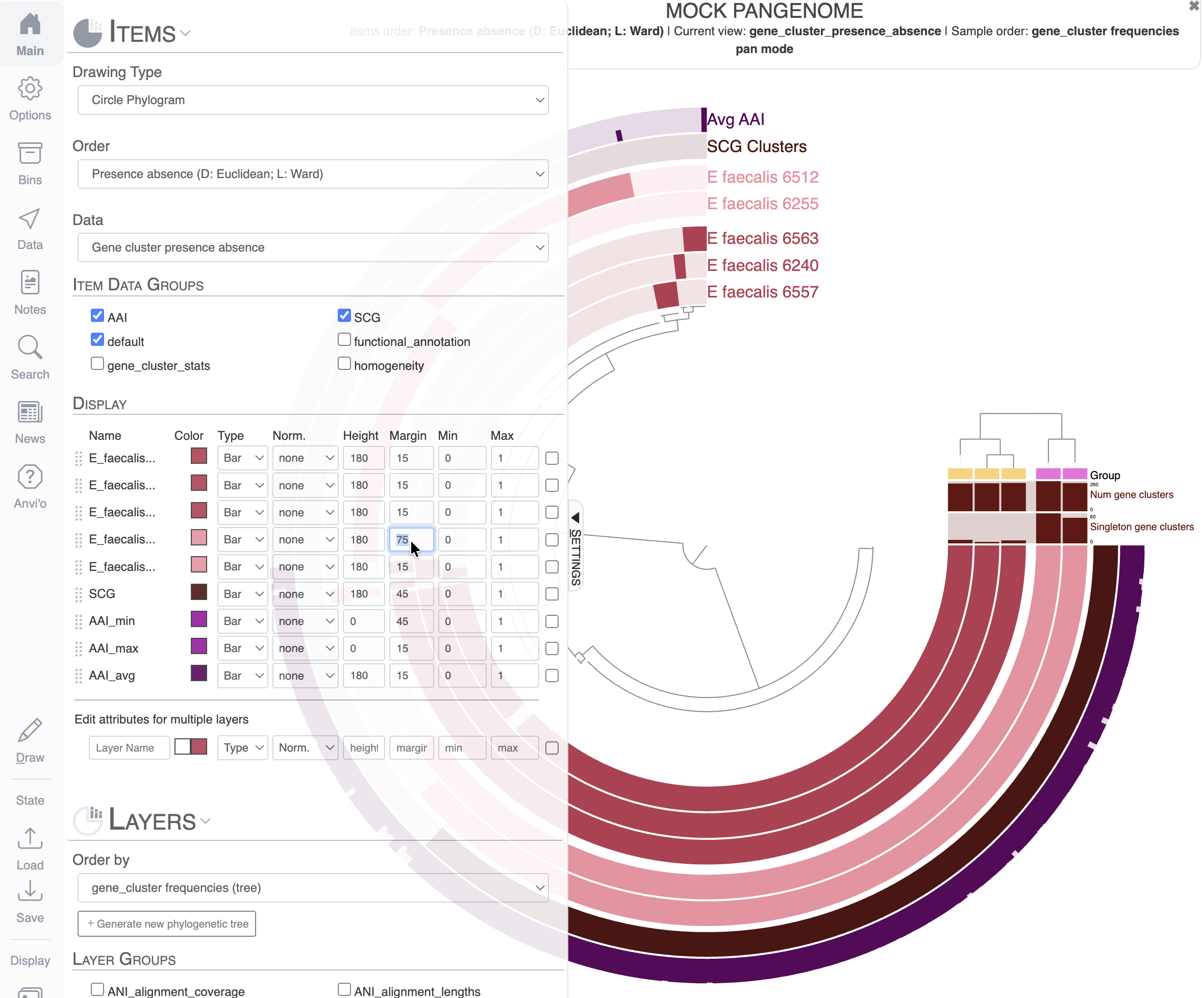
Finally, you can play with the margin between layers to increase the visual representation of these two groups of genomes:
Create bins and save a collection
Another important aspect of the interactive interface is the possibility to select items into bins and save them in a collection. If you are familiar with genome-resolved metagenomics, you have probably heard about binning: the process of putting together contigs supposedly belonging to the same population to create Metagenome-Assembled Genomes (MAGs). But fundamentally, the process of binning is the act of putting something together, whether it is contigs in a metagenomics context, or gene clusters in the context of pangenomes.
In the interface, you will find the Bins tab, where you will see the current active bin (selected by the blue circle on the left). You can also create new bins with the green + sign, and you can also name and rename bins. To add items to a bin, you can simply click on the figure on the items to add to your bin. You can also select multiple items by clicking on a branch in the inner dendrogram. Your next task is to create a few bins like that:
You can create new bins by holding the Cmd or Ctrl key when clicking on items
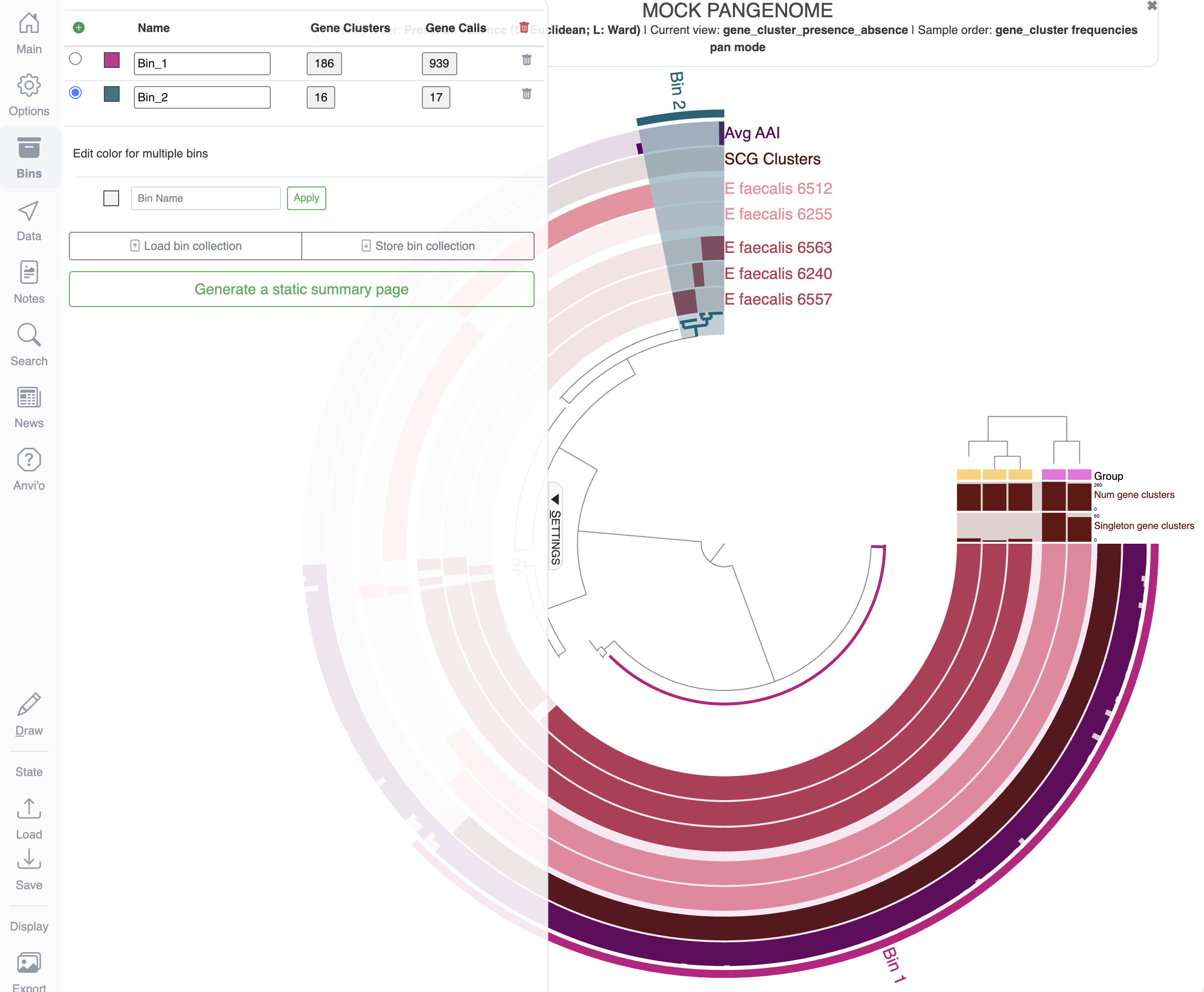
When you are happy with your selection, you can choose to save the collection of bins by clicking on the Store bin collection button:
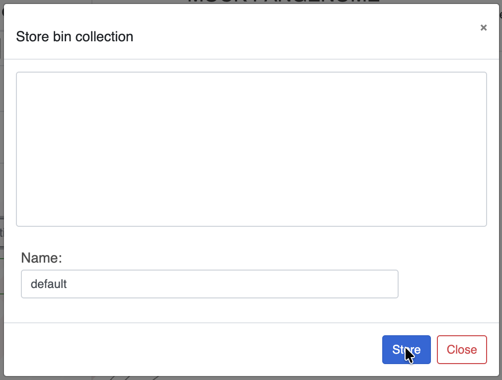
You can create and store as many Collections as you want, similarly to how the States work. Collections are stored independently from the States, so don’t forget to save them once you are done because if you close or refresh the page, you will lose your bins.
Use the search function
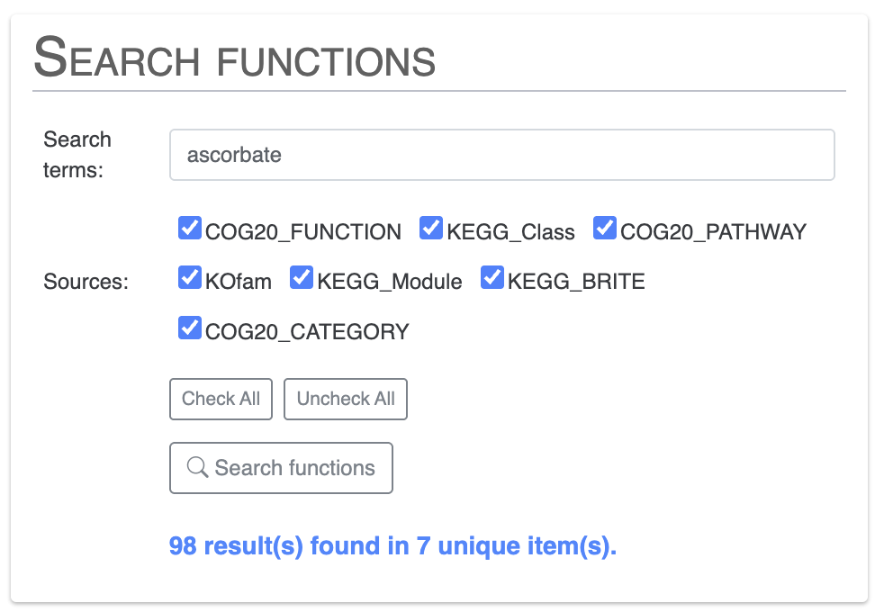
The Search tab allows you to explore your data and visualize the results on the display. For this exercise, we will look for gene clusters with specific functional annotations. First we will look for functions related to vitamin C, also known as ascorbate:
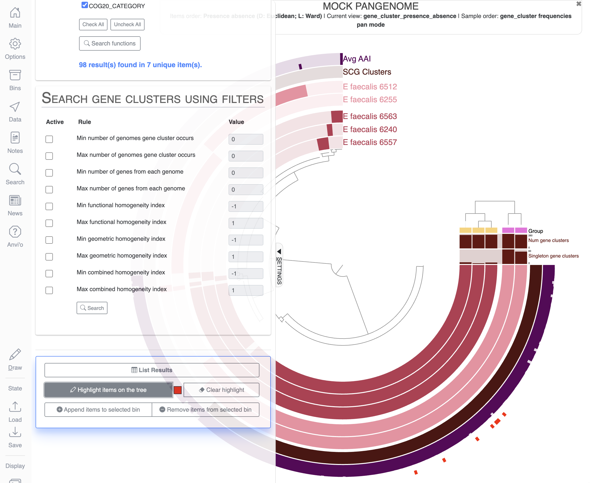
If you scroll down the Search tab, you can visualize which items on the display match the terms of your search by clicking on Highlight items on the tree:
Let’s create a new bin and a new collection to save the items matching our search for vitamin C related functions. For that, you will need to delete any bins already present in the Bins tab, create a new bin and maybe rename it to something meaningful like Vitamin_C:

Then in the Search tab, all the way down, you can click on the button Append items to selected bin:
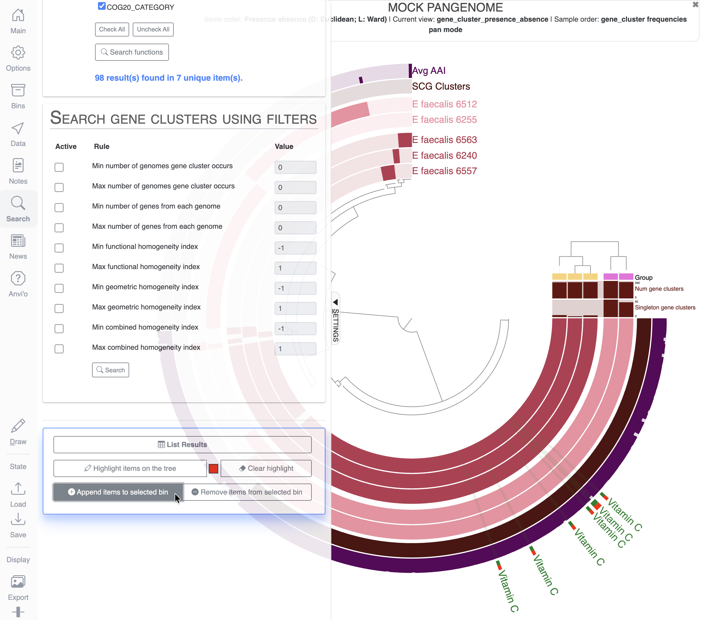
Don’t forget to save that new collection with a different name so you don’t overwrite the previous collection. As a reminder: you can have as many collections of bins as you want.
States and Collections for collaboration
All the states and collections are stored in one of the input databases for either anvi-interactive or anvi-display-pan (also valid for all interactive commands in anvi’o). Which means that if you were to share these databases with a colleague/collaborator who also has anvi’o on their computer, they would be able to load your States and Collections, modify them, add new ones, etc.
You can also export/import states and collections manually from the command line with the commands anvi-import-state/anvi-export-state and anvi-import-collection/anvi-export-collection.
Third exercise - phylogram, bootstrap values, data type
In this third and final part of this tutorial, we will use the command anvi-interactive again, but in manual mode: meaning without a contigs-db, and without displaying any read-recruitment data. In manual mode, you can display any data that you want: from a single newick tree, to a heatmap, to a mix of combined data types (continuous, categorical, stacked bar, etc).
After all, the interactive interface is just a fancy matrix visualization tool, where you can order your rows (items) and columns (layers) with dendrograms and you can augment the visualization with additional row/column information.
The manual mode is often used to display phylogenetic/phylogenomic trees, in a similar fashion to other programs out there like iTOL. It is also used to represent metabolic module heatmaps. These are just examples; your imagination is the limit.
Launching the display
anvi-interactive --manual \
                 -p PROFILE_MANUAL.db \
                 -t tree.nwk \
                 -d data.txt
Compared to the previous time we used anvi-interactive, we are now using the flag --manual for the manual-mode. We also provide a tree for the organization of Items, and a data table containing information about these items, where each column will be shown as Layers on the interface. Finally, we need to use the flag -p for a profile-db, which is normally used for storing read recruitment information. In manual-mode, we use the profile-db only to store the States and Collections. You don’t need to have one present in your directory the first time you use anvi-interactive in manual-mode; it will be created on the fly.
In this case, the profile-db is included in the datapack because I created a few States for you to explore.
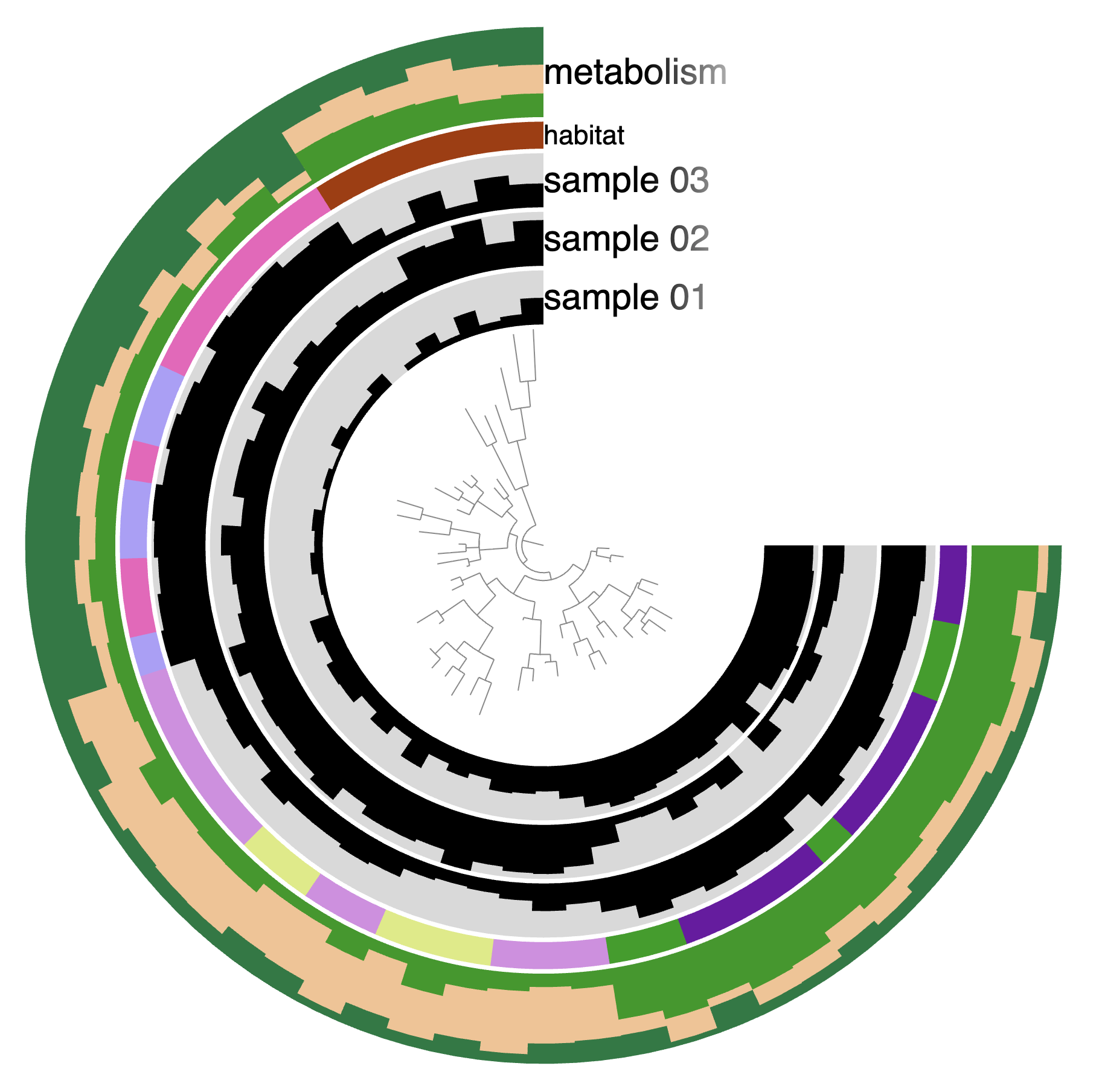
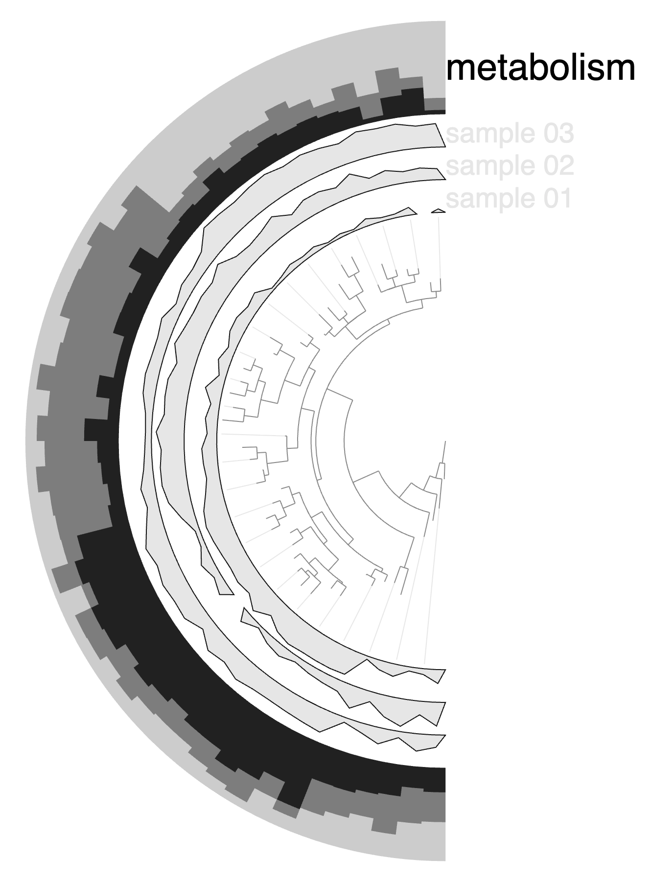
From a circle to a rectangle
Here is what the display should look like for you:
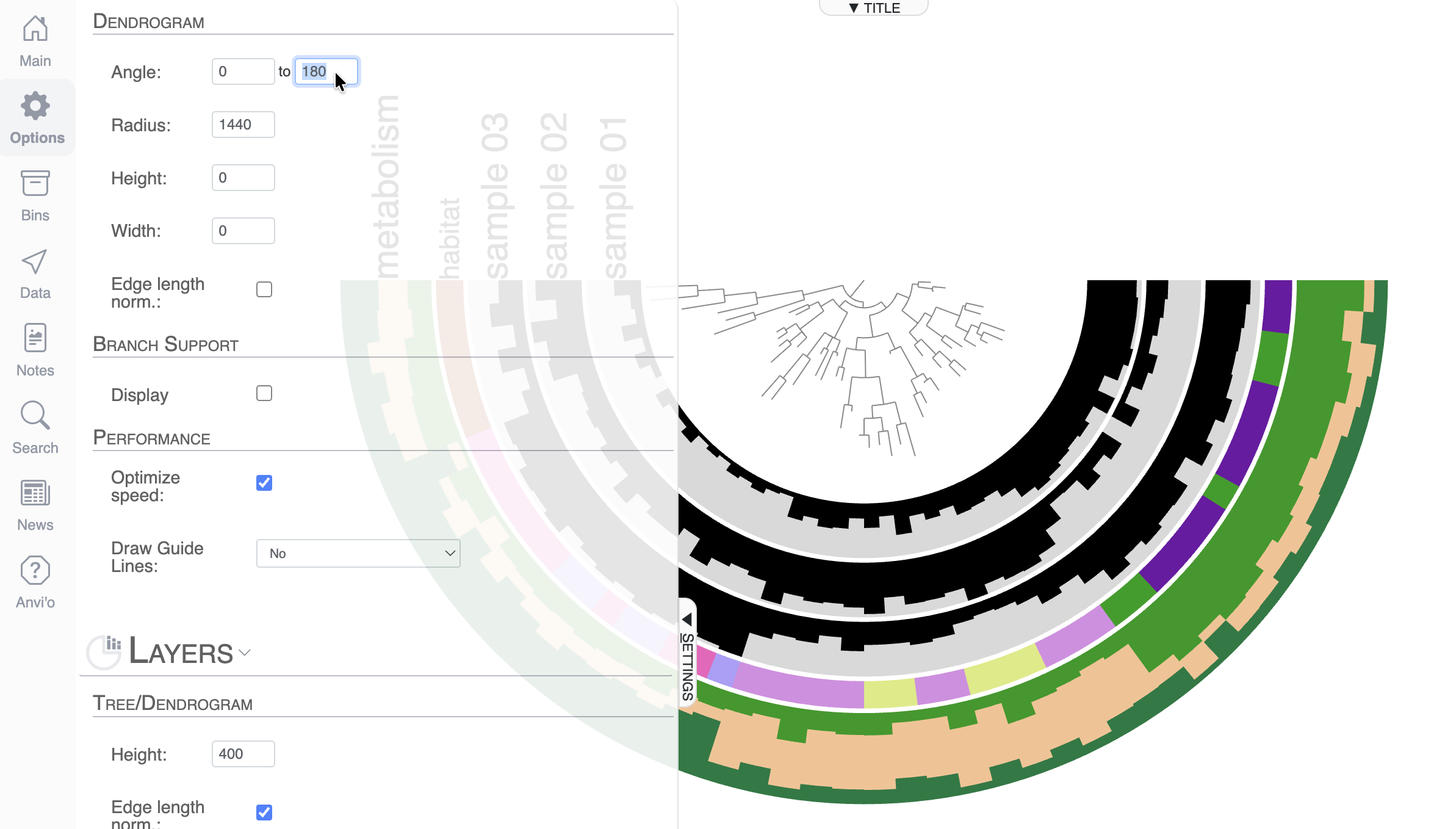
By default, anvi’o uses the 3/4 circle shape, but you can change that. First of all, you can control the angle of the display in the Options tab, and make it 180°:
But in the context of a phylogenomic tree, you might prefer to switch to a more rectangle-type of display, which you can do on the top of the Main tab. You can switch from Circle Phylogram to Phylogram.
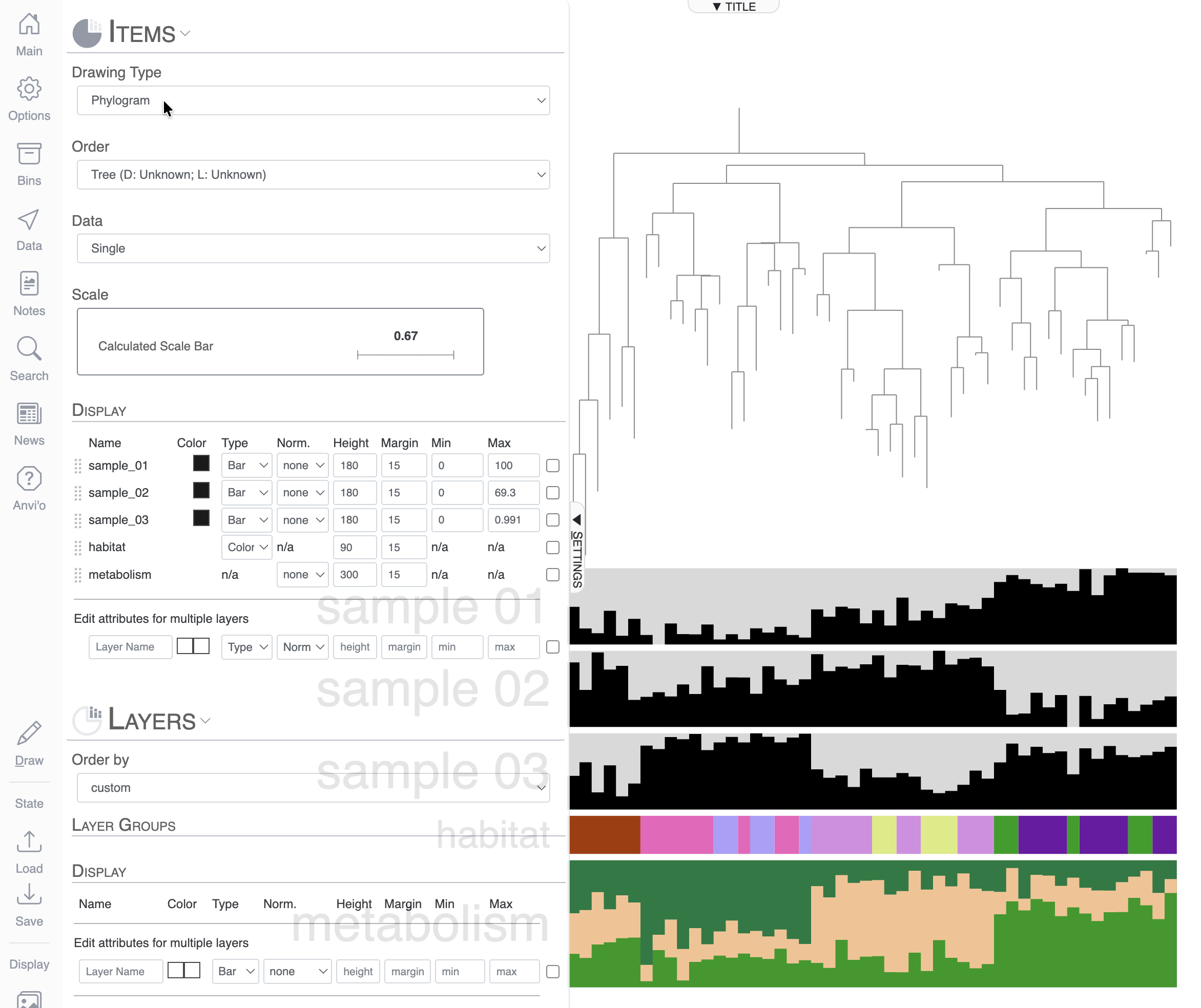
You can modify the height and width of the display in the Options tab:
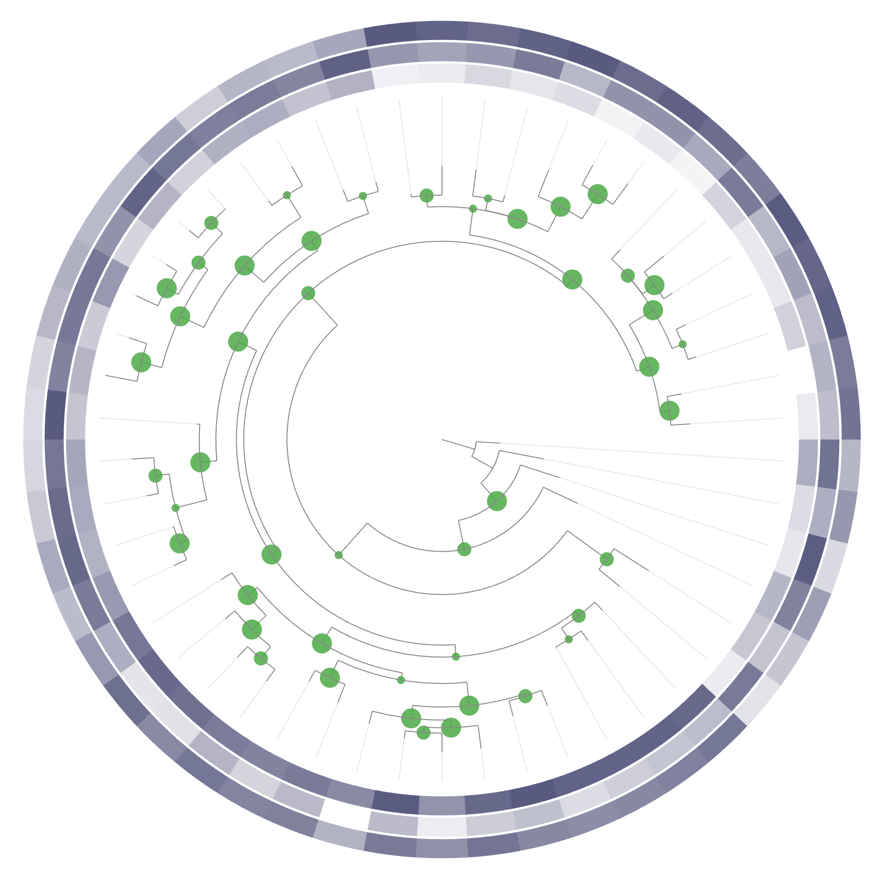
Bootstrap values and rooting the tree
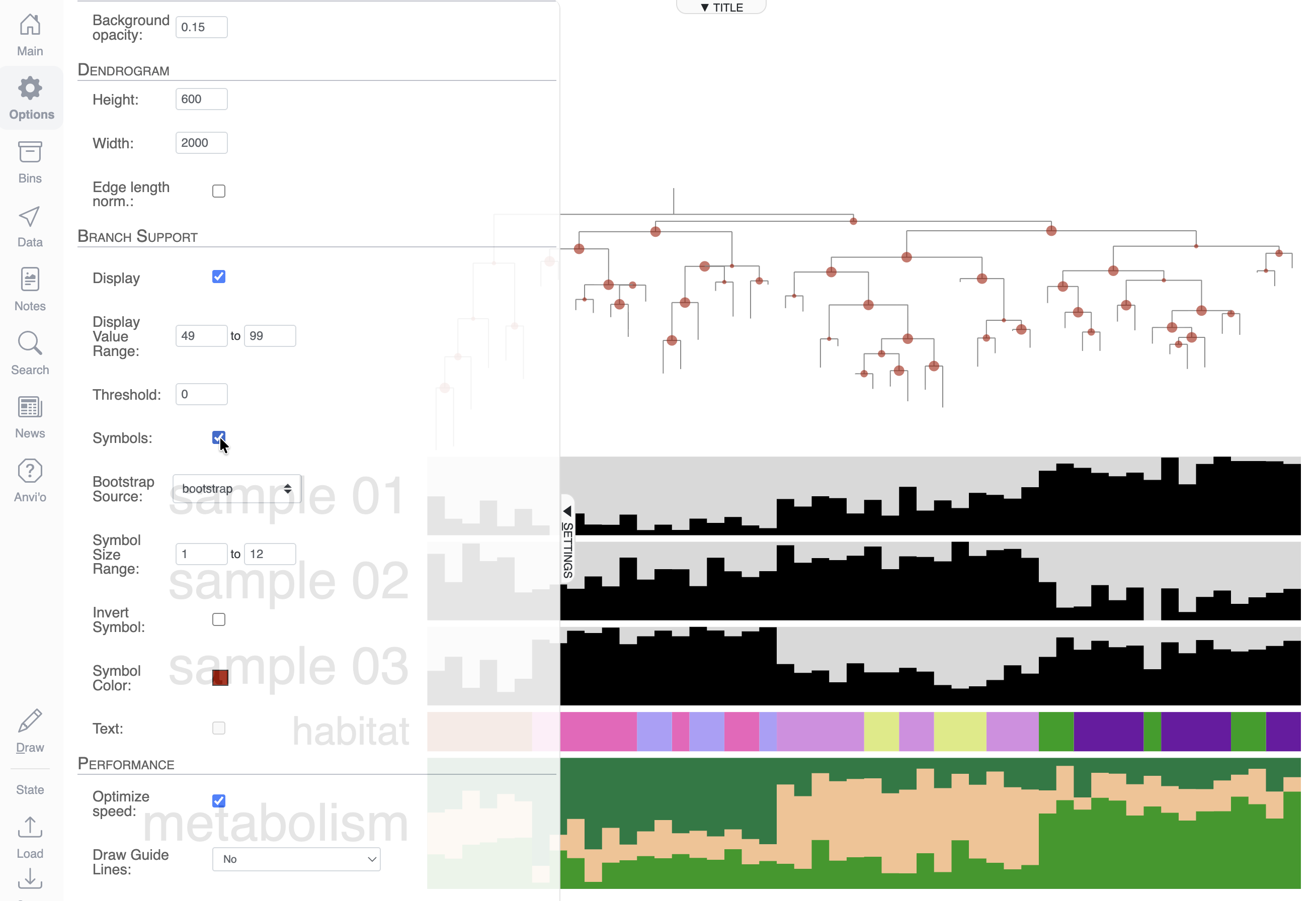
If you are familiar with phylogenomic trees, you know that some software will compute and include bootstrap values in your tree. If they are available, you can ask anvi’o to display them in the Options tab:

You can also choose to display the values as a circle shape by using the Symbols checkbox:
Another typical step in phylogenomic tree manipulation is rooting the tree, which you can do by right-clicking on a branch that you want to use as the root:
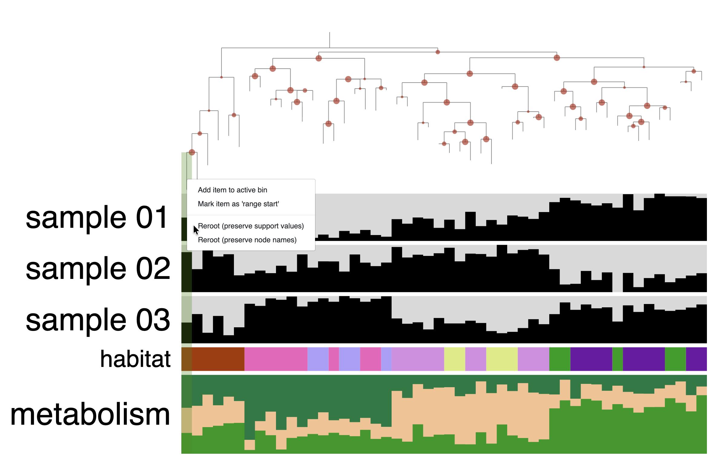
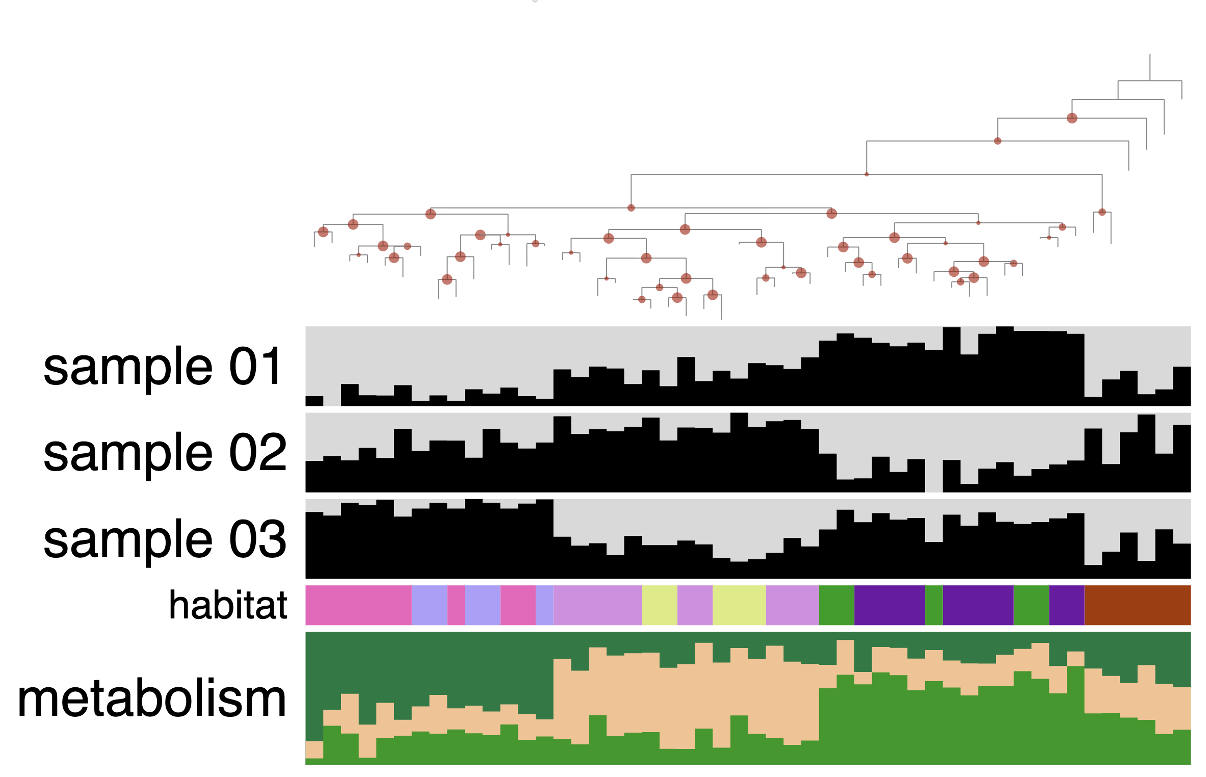
You can also select a node/group of leaves to do the rooting. You will need to hold the Cmd or Ctrl key + right-click on the dendrogram to open the context menu and select re-rooting.
Show/Hide - Why two ways to re-root the tree?
As you can see when you right-click, there are two ways to re-root the tree. One that preserves the branch support values, and one that preserves the node names. Ensuring that branch support labels are correctly placed after rooting a tree is not as intuitive as it seems and it has been a well-known issue in the field.
In short, the branch support value is, as the name suggests, a branch-associated value. But in the newick format, it is not possible to associate data/value to branches, only to nodes. The convention is that the branch support value is stored in the node under the branch. But after rooting the tree, some nodes can be upside-down and the branch support value stored at that node should not be used to represent the value for the branch above, but for a branch under the node. This is why we have two ways to reroot the tree: one that will consider the values stored at the nodes as branch support values and will correctly rearrange the branch support values so that they always correspond to the branch above; and another way to reroot where the labels are just node labels, so they should not be rearranged.
Here is a figure from Czech et al., 2017 that summarises it:
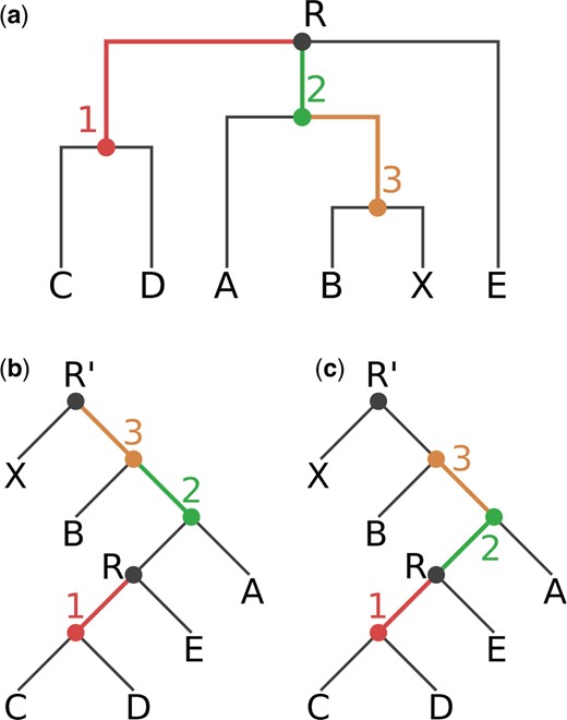
Fig. 1. Our exemplary tree, before and after rooting on the branch leading to the tip node X. The rooted trees contain an additional root node R’. (a) Original rooting (via top-level trifurcation) and visual representation of our Newick test tree TN. Inner nodes and branches are colored according to the correct node label to branch mapping of TN. (b) Tree rooted on node R’. Node labels are mapped incorrectly to branches, resulting in a tree with an erroneous node label to branch value mapping. (c) Tree rooted on node R’. Node labels are correctly mapped to the branches of the tree.
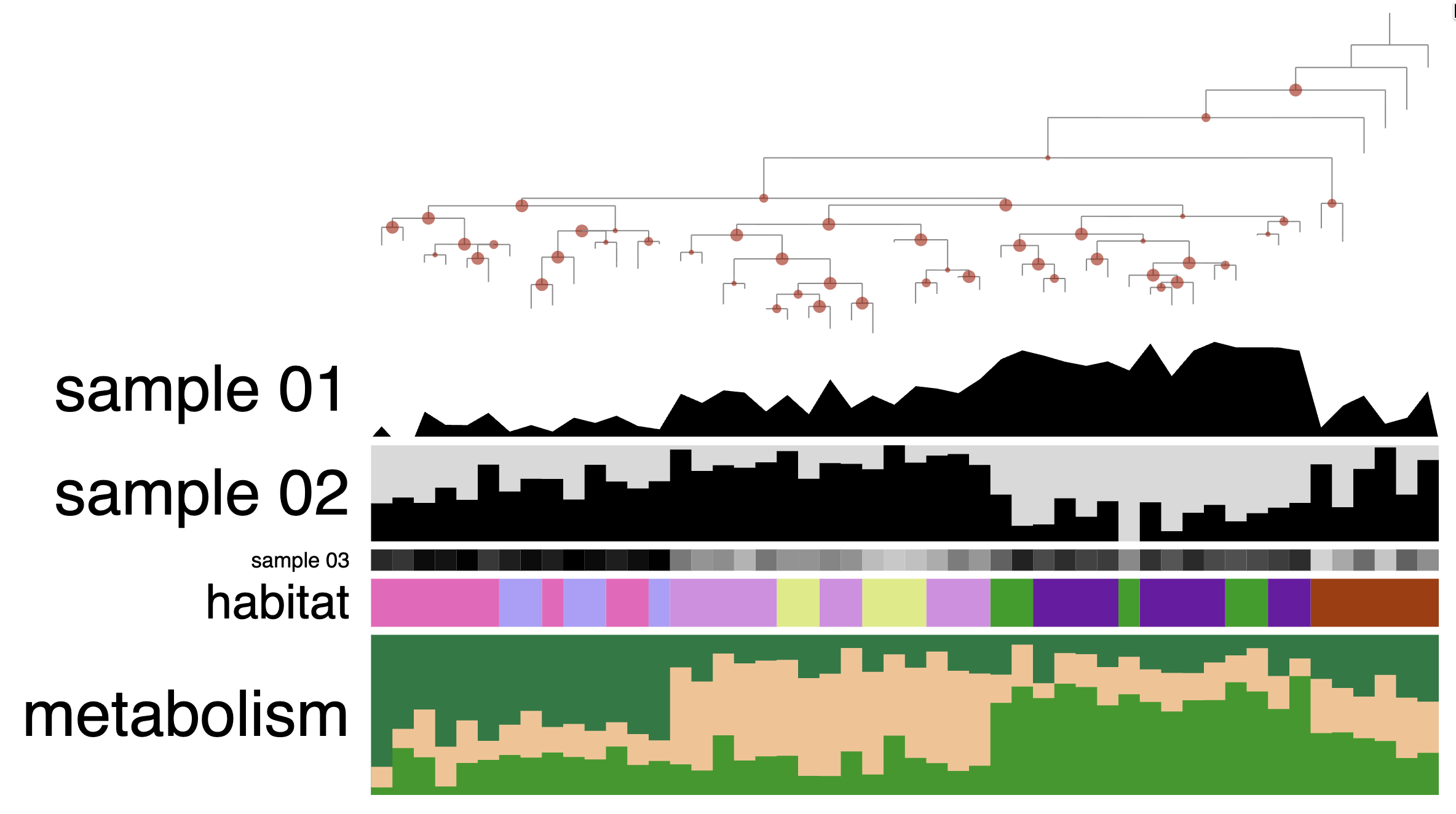
Cosmetics: bar, intensity, line, text, size
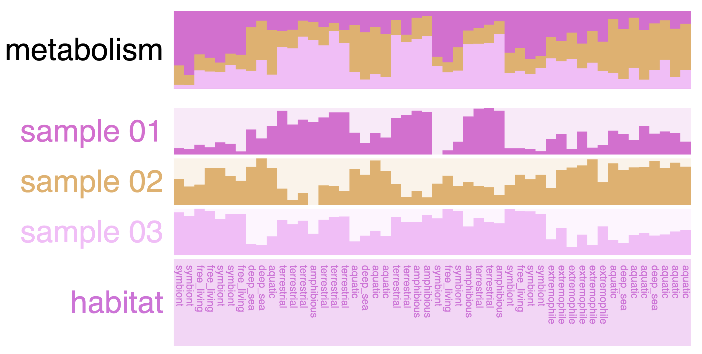
In this mock dataset, we have different data types represented in the layers: numerical, categorical and a stacked bar.
Numerical layers
There are three “Sample” layers, which could be relative abundance in a sample, or you can think about other attributes like genome size, GC content, etc.
For the next task, we will change these layers to different types. Right now, they are all barplots, but you can choose between bar, intensity (like a heatmap), and line:
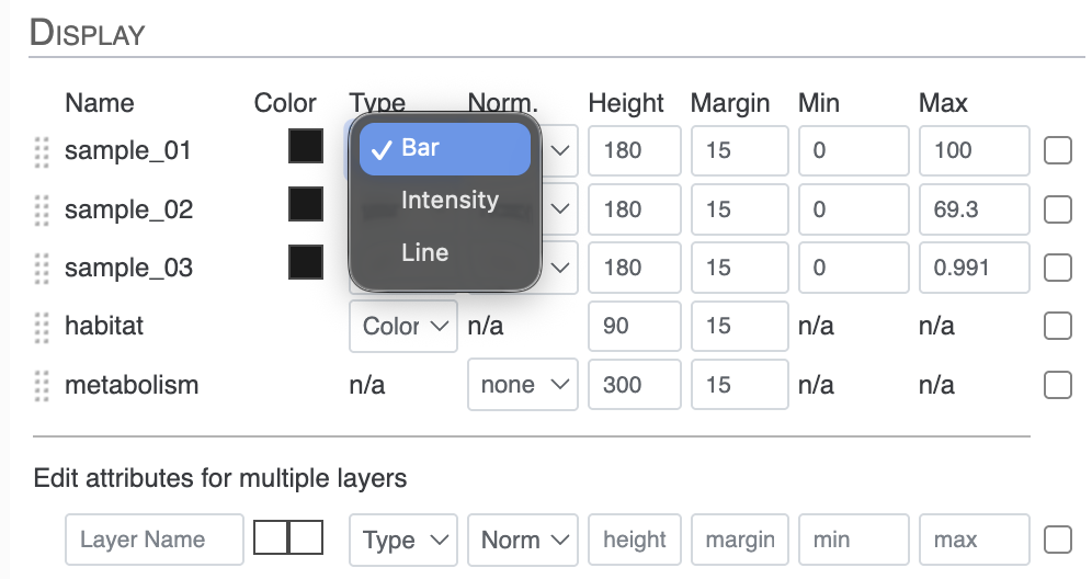
If you also change their heights, you can make a display like this one:
You can also transform your data directly in the interface with the Norm. attribute between Type and Height in the Main tab. You have the choice between log or square root transformation.
Categorical layers
The next layer called ‘habitat’ is a categorical layer, and you can choose to display a color-coded layer and modify the colors in the Legends section of the Main tab:
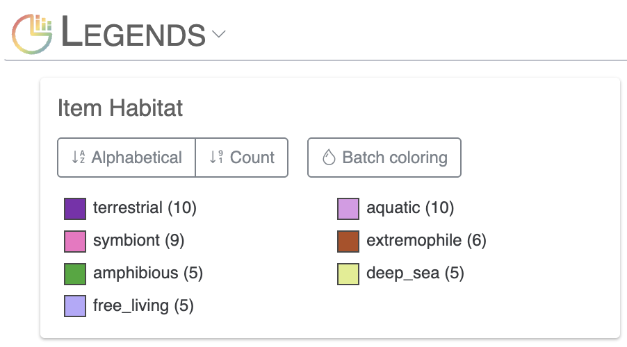
Or choose to directly display text on the display:
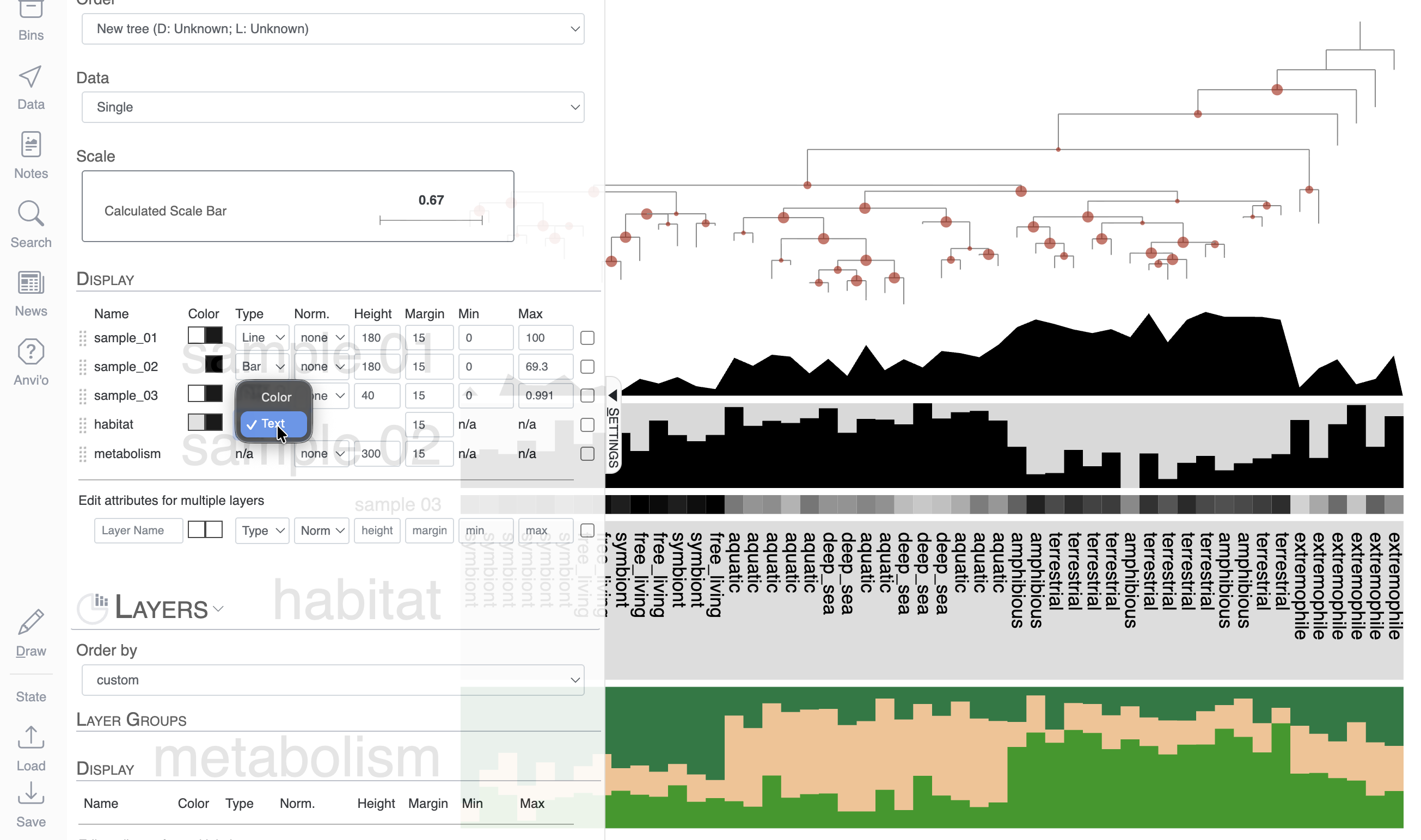
Stacked bar layers
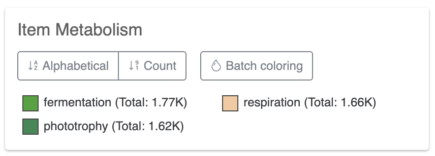
These are just cool looking. You cannot change their type to anything else but stacked bar, of course. But you can always change the height of the layer and change the colors in the stacked bar in the Legends section of the Main tab:
Explore existing states
If you click on Load, you will see that there are a few existing States. Feel free to load them and see how one can use the interface to create different figures/displays using the exact same data:
Bonus
If you use the Data tab, you can check the names of the branches of this mock phylogenomic tree.
Final words
The anvi’o interactive interface is a powerful tool that rewards exploration. Don’t hesitate to click around, try different views, change settings, and draw the display in different configurations. Remember:
- States are your friend and save your visualization settings often so you don’t lose your work.
- SVG export is the way to go for publication figures.